This gadget will allow you to subscribe to the US Geological Survey (USGS) real-time, worldwide earthquake list. It shows the latest magnitude 1 and above earthquakes for the past day as color coded (by depth and age) icons with tool tips on a Google Maps backdrop - the older the earthquake, the more translucent the icon will look.
The gadget has a list tab which displays the earthquake information as a text list with hyperlinks for more details - the list can be sorted by the earthquake magnitude, depth as well as the date-time. Using the list, you can easily find and locate the largest, the latest or the deepest earthquakes for the past day.
You can leave this gadget on the screen and it will update itself as it receives the latest feed. Upon receiving the data, it will automatically zoom to the latest earthquake epicenter. Clicking on an earthquake icon will bring up more information about the earthquake from the USGS site.

About Geospatial Applications, FME, Visual Studio, gvSIG, Global Mapper, Programming, LiDAR, GIS, Google Maps, SAGA GIS, Android, QGIS
Monday, September 27, 2010


Monday, September 20, 2010
Isolating hot spots by reclassification and zone area calculations in SAGA GIS
Another way to summarize and visualize a continuous grid surface e.g. a smooth surface that modeled the density of occurrences of point data incidents, is to reclassify the continuous data into discrete groups. An example of a continuous data surface is shown below.
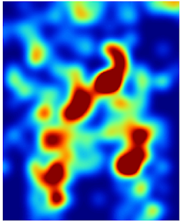
In SAGA GIS, the Reclassify Grid Values module can do the zoning. Once the continuous surface has been classified into groups, meaningful numerical information such as the area of the hot spots can be derived.
The following describes how I use SAGA GIS to reclassify and calculate the zone area values.
Reclassifying into discrete zones

In SAGA GIS, the Reclassify Grid Values module can do the zoning. Once the continuous surface has been classified into groups, meaningful numerical information such as the area of the hot spots can be derived.
The following describes how I use SAGA GIS to reclassify and calculate the zone area values.
Reclassifying into discrete zones
- Start up SAGA GIS. Load in a continuous grid layer e.g. hotspot.sgrd.
- In the Workspace pane on the left, select the grid layer. In the Options pane on the right, click the Description pane.
- Examine the Value Range and note down the values, e.g. 0 - 10. Note: this will be used to determine how to group the data.
- Select Modules | Grid | Tools | Values | Reclassify Grid Values.
The Reclassify Grid Values dialog box appears. - In the Grid system drop down list, choose the grid system e.g. "30;354x420y...".
- In the Grid drop down list, choose the grid layer for reclassification, e.g. "01.hotspot".
- In the Method drop down list, choose simple table.

- Click the Method simple table's Lookup Table row. Click [...].
The Lookup Table dialog box appears. - Use the minimum, maximum, and new columns to define the input ranges to reclassify, e.g. 0~3 to 1, 3~6 to 2 and so on.

- Click Okay twice.
The grid layer is reclassified.


Visualizing the discrete zones
- In the Workspace pane, double click the discrete zone grid layer e.g. "03.Reclassified Grid" and display in a new map window.
Note: the default colors may not be optimal in showing off the zones as shown below.
- On the Options pane on the right, click the Settings tab. Change the Display:Color Classification Type to Lookup Table.

- Click the Lookup Table's Table row. Click [...].
The Table dialog box appears. - Enter the NAME, DESCRIPTION, MINIMUM, MAXIMUM values appropriate for the discrete zones grid layer and define unique colors for each range, as shown below.

- Click Okay.
- Click Apply.
The map window is updated with the new colors which show off the zones better.


Calculating the zone areas
- Select Modules | Geostatistics | Grids | Zonal Grid Statistics.
The Zonal Grid Statistics dialog box appears. - Click the Grid system drop down list and choose the discrete grid layer's system.
- In the Zone Grid drop down list, choose the discrete zone grid layer, e.g. "03.Reclassified Grid".

- Click Okay.
The zonal statistics table is created.
- In the Workspace pane, double click the newly created zonal statistics table e.g. "01.Zonal Statistics" to display it.
Note: the Count column counts the number of grid cells within a zone.
- Select Modules | Table | Calculus | Table Calculator.
The Table calculator dialog box appears. - In the Table drop down list, choose the newly create table, e.g. "01.Zonal Statistics".
- In the Formula field, type in the formula to calculate the zone area, e.g. if the area of a grid cell is 2 square meter, then the zone area formula is b*2, where b refers to the second column.
- In the Field Name, type in the new field name, e.g. area.

- Click Okay.
The new table is generated.
- In the Workspace pane, double click on the newly created table.
The new table is displayed. Note the new area field showing the calculated zone area.


Monday, September 13, 2010
Isolating hot spots using Isolines in Saga GIS
In my previous post, I generated a surface grid layer of total incident occurrences where a graduated color sequence indicate areas with the highest density of occurrences i.e. the hot spots in red, as shown in the figure below.
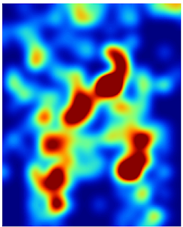
We can further demarcate the hot spots with SAGA GIS's Contour Lines from Grid module.

We can further demarcate the hot spots with SAGA GIS's Contour Lines from Grid module.
- Start up SAGA GIS and load in the grid layer of the total incident occurrences.
- Select Modules | Shapes | Grid | Contour Lines from Grid.
The Contour Lines from Grid dialog box appears. - In the Grid system drop down list, choose the grid system of the grid layer, e.g. "30; 354x 420y...".
- Click the Grid row drop down list and choose the grid layer, e.g. "03.ifelse(lt(a,0),0,a)".
- If necessary, change the Minimum Contour Value, Maximum Contour Value and Equidistance values.

- Click Okay.
The contour lines are generated.
Note: in the Workspace pane, double click the contour line shape line layer to display it overlaid on the incident occurrence grid layer, as shown below.
Labeling the contour lines - In the Workspace pane, select the Line shape layer of the contour lines e.g. "01.ifelse(lt(a,0),0,a)".
- In the Options pane on the right, click the Display:Label Attribute drop down list and choose the attribute field to use for labeling, e.g. "ifelse(lt(a,0),0,a)".

- Click Apply.
The contour lines are labeled.


Wednesday, September 8, 2010
Intergraph introduces GeoMedia 3D
I haven't got a chance to try out GeoMedia 3D but it certainly looks promising. It's an add-on to the core GeoMedia product, which adds in an additional 3D Map window seamlessly into the framework and you could manipulate and query the features just like in the basic 2D map window.
Monday, September 6, 2010
Detecting hot spot patterns in point incidents data with SAGA GIS
SAGA GIS has a number of grid analysis commands that can be used to detect patterns (i.e. find hot spots) in point data e.g. accident incidents. An example incident distribution on a map is shown in the figure below.

The point vector data may be storing additional attributes about the incident such as the number of occurrences.

Just by looking at the vector point data, it is impossible to detect a pattern or hot spot incidents in the area. By forming a graphical occurrence distribution surface from the vector point data with a grid analysis tool like SAGA GIS, it would be so much easier to visualize the areas of high incident density. An example of this surface is shown below, overlaid with other map features for reference.

Below are the steps I took to generate the grid surface for visualizing the incident patterns.
Import vector point data

The point vector data may be storing additional attributes about the incident such as the number of occurrences.

Just by looking at the vector point data, it is impossible to detect a pattern or hot spot incidents in the area. By forming a graphical occurrence distribution surface from the vector point data with a grid analysis tool like SAGA GIS, it would be so much easier to visualize the areas of high incident density. An example of this surface is shown below, overlaid with other map features for reference.

Below are the steps I took to generate the grid surface for visualizing the incident patterns.
Import vector point data
- Start up SAGA GIS.
- Select Modules | File | GDAL/OGR | OGR: Import Vector Data.
The OGR: Import Vector Data dialog box appears. - Click the Files row. Click the [...] button on the right. Browse and select the point vector data file e.g. Incidents.shp. Click Open.
The selected file is displayed in the OGR: Import Vector Data dialog box.
- Click Okay.
The point data is imported into SAGA GIS.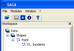


Convert the vector point data to a grid layer
- Select Modules | Grid | Gridding | Shapes to Grid.
The Shapes to Grid dialog box appears. - Click the Shapes drop down list and select the previously imported vector points e.g. 01.Incidents.
- Click the Attribute drop down list and select the field to get the new grid cell values, e.g. OCCURRENCE.
- Click the Preferred Target Grid Type drop down list and select a suitable data type e.g. Integer (2 byte).

- Click Okay.
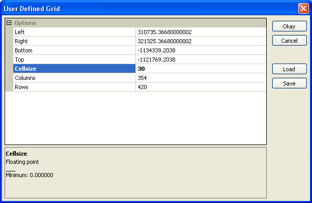
The User Defined Grid dialog box appears. - In the Cellsize field, type in the new cell size e.g. 30.

- Click Okay.
The vector points are rasterized into a new grid layer.


Workaround the Aggregate module's Sum No Data cell value bug
SAGA GIS 2.0.5's Aggregate module has a problem summing grid cells with negative values, i.e. cells with no data and usually represented with a large negative number e.g. -99999. In order for the SUM function to work, those large negative values have to be set to 0. This can be done by using the Calculus module as described below.
- In the Workspace pane, select the newly created point grid layer e.g. 01.Incidents [OCCURRENCE].

- In the Object Properties pane on the right, click the Settings tab. Then change the No Data field values to "0; 0".

- Click Apply.
- Select Modules | Grid | Calculus | Grid Calculator.
The Grid Calculator dialog box appears. - In the Grid system drop down list, select the newly created grid layer's system, e.g. "30;354x 420y;...".
- Select the Grids row. Click the [...] button
The Grids dialog box appears.
- On the list on the left side, select the newly created grid layer, e.g. 01.Incidents[OCCURRENCE]. Click the >> button.
The selected grid layer is moved to the list on the right. - Click Okay.
The Grids dialog box is closed. - In the Formula field, type in ifelse(lt(a,0),0,a).
Note: this formula tells the Calculator to replace all grid cell values below 0 with the value 0.
- Click Okay.
A new grid layer is created with no negative values.


Using Aggregate to sum adjacent grid cells
- Select Modules | Grid | Construction | Aggregate.
The Aggregate dialog box appears. - In the Grid system drop down list, choose the previously created grid layer's system, e.g. "30;354x 420y;...".
- In the Grid drop down list, select the newly created grid layer without negative values, e.g. ifelse(lt(a,0),0,a).
- In the Aggregation Size field, type in an appropriate size (in cells), e.g. 20. In the Method drop down list, choose Sum.

- Click Okay.
The aggregated grid layer is created.
This is how the aggregated layer looks like in the map view.


Resample the aggregated grid layer to match the original point grid layer.
- Select Modules | Grid | Construction | Resampling.
The Resampling dialog box appears. - In the Grid system drop down list, select the aggregated grid layer's system, e.g. "600;17x21y...".
- In the Grid drop down list, choose the aggregated grid layer, e.g. "ifelse(lt(a,0),0,a)".
- In the Target Grid drop down list, choose grid.

- Click Okay.
The Choose Grid dialog box appears. - In the Grid system drop down list, choose the original point grid layer's system, e.g. "30;354x420y...".

- Click Okay.
The Down-Scaling dialog box appears.
- Click Okay.
The aggregated grid layer is resampled to match the original point grid layer's dimensions.


Monday, August 30, 2010
Create LiDAR point density map with SAGA GIS
I am finding SAGA GIS to be quite useful and powerful in processing LiDAR data. One of the typical task is to determine the point density of a LiDAR survey. Usually this is in the form of a text report showing the file or tile and the calculated LiDAR point density i.e. the number of points per square meter. Some reports will even show the minimum, maximum and average values. I have used SAGA GIS to create a graphical point density map as shown in the figure below.
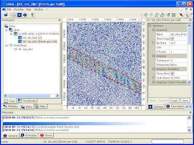
The steps to create the point density map are described below.
Import LiDAR LAS file

The steps to create the point density map are described below.
Import LiDAR LAS file
- Start up SAGA GIS.
- Select Modules | File | Shapes | Import | Import LAS Files.
The Import LAS Files dialog box appears. - Click the Input File row. Click the [...] button on the right.
The Open dialog box appears. - Browse and select a LAS file, e.g. lub_tile1.las. Click Open.
The selected file name is displayed in the Import LAS Files dialog box.
- If necessary to filter the LiDAR points by attributes, toggle on any Attributes to import besides x,y,z ... e.g. classification. Click Okay.
The LAS file is imported into SAGA GIS.
Note: click the Data tab of the Workspace pane to see the imported point cloud in the Data tree.


Use Convert Point Cloud to Grid Module to generate the Points Per Cell grid
- Select Modules | Shapes | Point Clouds | Conversion | Point Cloud to Grid.
The Point Cloud to Grid dialog box appears. - Click the Points row drop down list and select the previously import LAS file, e.g. 01.lub_tile1.
- In the Cellsize field, type in the desired output grid cell size e.g. 1.

- Click Okay.
The conversion has created two grid layers containing Z as well as Points per Cell values.


Each cell in the Points per Cell grid layer contains the number of LiDAR points in that cell. If the cell size you chose was 1 meter, then the cell value is directly the point density per square meter and you don't have to do any further grid calculation to get the final value. If you want to calculate the point density per classification, then prior to running the Point Cloud to Grid module, you have to filter out the Point Cloud first.
Display the Points per Cell grid layer
- In the Data tree, right click on the Points per Cell grid layer created previously, e.g. 02.lub_tile1[Points per Cell].
A pop up menu appears. - Choose Show Grid.
The grid layer is displayed. - On the right pane, click the Legend tab.
The legend of the point density is displayed.
Note: the blues have the lowest density (less than 1.2 points per square meter) while the reds have the highest density (more than 5.2 points per square meter).

Monday, August 23, 2010
Create a bare earth DTM from a classified LiDAR LAS file with SAGA GIS
A LiDAR LAS file can have its point clouds classified under a few standard classes e.g. Ground, Low Vegetation, Building, etc. For generating a bare earth digital terrain model (DTM) without vegetation and structures, only the points classified as Ground class are necessary. An example is shown below.
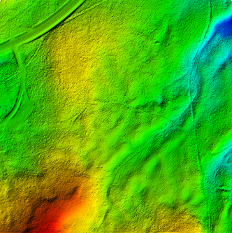
It is relatively straightforward to use SAGA GIS to import the LiDAR LAS file, to extract out a subset containing only the ground points, and then to interpolate the points into a bare earth surface model. I tried out the following steps to create an ESRI ArcGrid ASCII file of the bare earth ground surface.
Import the LiDAR LAS file

It is relatively straightforward to use SAGA GIS to import the LiDAR LAS file, to extract out a subset containing only the ground points, and then to interpolate the points into a bare earth surface model. I tried out the following steps to create an ESRI ArcGrid ASCII file of the bare earth ground surface.
Import the LiDAR LAS file
- Start up SAGA GIS. Select Modules | File | Shapes | Import | Import LAS Files.
The Import LAS Files dialog box appears. - Select the Input File row. Click the [...] button on the right. In the Open dialog box, browse and select the LAS file, e.g. lub_tile1.las. Click Open.
The selected file name is displayed in the Import LAS Files dialog box. - In the Attributes to import besides x,y,z list, toggle on classification and any other attributes you want.

- Click Okay.
The LAS file is imported into SAGA GIS.

Extract out Ground points
- Select Modules | Shapes | Point Clouds | Tools | Point Cloud Reclassifier / Subset Extractor.
The Point Cloud Reclassifier / Subset Extractor dialog box appears.
- Click the Point Cloud row. Choose the newly imported point cloud in the drop down list, e.g. 01.lub_tile1.
- Click the Point Cloud Attribute row. Choose classification.
- In the Mode of operation row, choose Extract Subset.
- In the Method single old value row, type in 2 for Ground class.
- In the Method single new value row, type in 2 to keep it the same value in the subset.

- Click Okay.
The point cloud subset of only Ground points is created. By default, the new layer will have the string subset_classification appended to the input name.


Interpolating the bare earth ground surface
- Select Modules | Grid | Gridding | Interpolation from Points | Triangulation.
The Triangulation dialog box appears.
Note: Other interpolation algorithm is also fine depending on your requirements. - In the Points row, choose the newly created subset e.g. 02.lub_tile1_subset_classification.
- In the Attribute row, choose Z.

- Click Okay.
The User Defined Grid dialog box appears. - Optional. In the Cellsize row, type in the desired output cell size e.g. 1.

- Click Okay.
The grid layer is created.


Exporting the bare earth surface in ESRI ArcGrid ASCII format
- Select Modules | File | Grid | Export | Export ESRI Arc/Info Grid.
The Export ESRI Arc/Info Grid dialog box appears.
- In the Grid system row, choose the grid system of the bare earth surface grid layer, e.g. 1;684x 685y; 312479.7x 5195216.9y.
- In the Grid row, choose the bare earth grid layer, e.g. 01.lub_tile1_subset_classification(Triangulation).
- In the File row, click the [...] button. Browse and specify the output file name, e.g. C:\Temp\dtm.asc. Click Save.

- Click Okay.
The bare earth ground surface is exported out.


Subscribe to:
Posts (Atom)
